Appendix D: Chart Interpretation
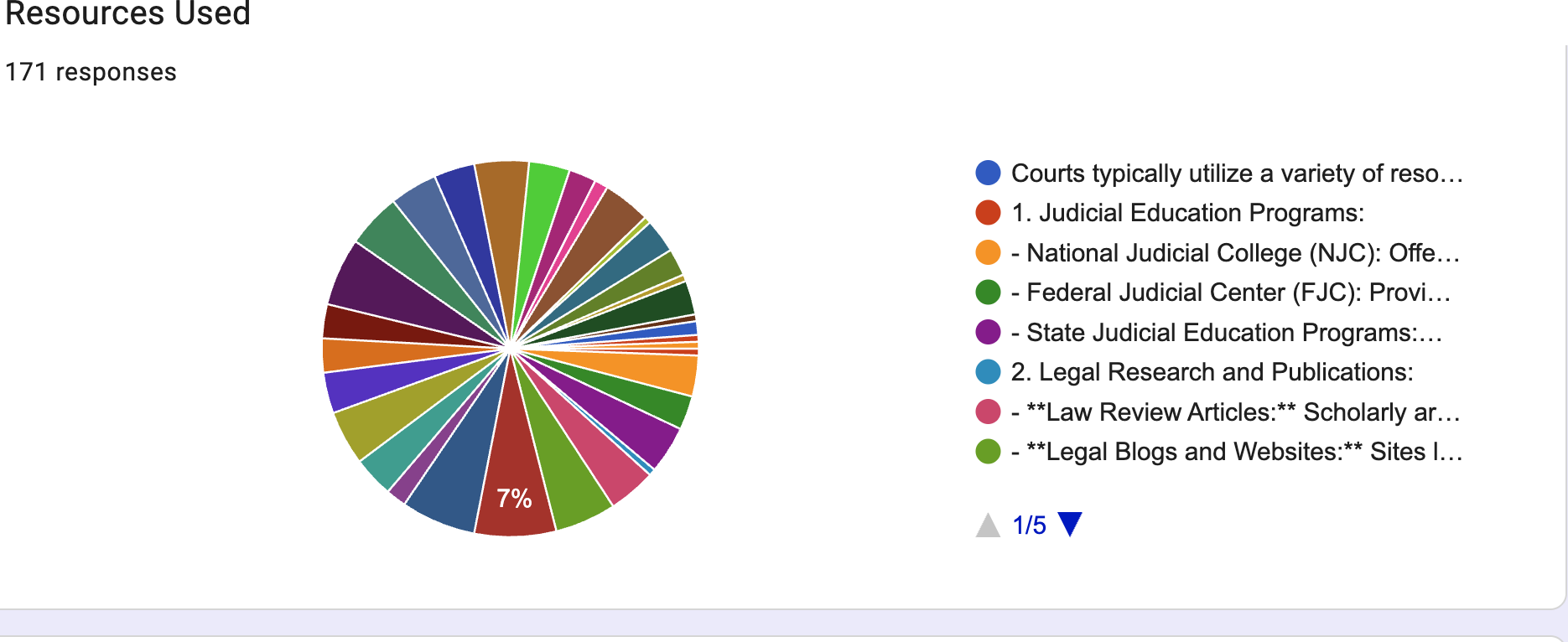
Chart 5 — Original Google Form chart: Resources Used (raw output)
The pie chart below is Google Forms’ own auto-generated chart for the “Resources Used” question (171 of 176 respondents answered). Because several answer options in the form were long numbered list items with sub-bullets, Google Forms plotted each sub-bullet as its own slice, producing roughly 25–30 thin wedges. It is reproduced here across its five legend pages exactly as it appears in the form’s Responses tab.
Legend 1 of 5 — Judicial Education & Legal Research categories
Legend 2 of 5 — Books/Treatises, CLE, Expert Testimony & Regulatory Reports